
By Myra Ahmed

A lot of SaaS competitor comparison pages play it way too safe. Even though that’s where your prospect makes a buying decision. 👀
❌ These comparison pages usually don’t address the competitor’s weaknesses.
❌ Often contain generic messaging like “our intuitive UI!” and “great customer support!”
I get it: you want to be careful around publicly criticizing a competitor.
But how else will your prospects know what makes your competitor weak and your product strong…?
That’s why I’d advise you to include a “Them vs. Us” comparison on your page.
Use the punchy “Them vs. Us” approach to SaaS competitor comparison pages
ClickUp highlights each competitor’s weakness in contrast to their strength:
✦ Monday comparison page headline = “Monday is all over the place.”
Then ClickUp’s comparison page highlights these pain-points and capabilities…
|
Them:
|
Us:
|
✦ Jira comparison page = “For an app focused on sprints, it sure is slow.”
The ClickUp’s comparison page highlights these pain-points and capabilities…
|
Them:
|
Us:
|
See how simple and impactful the “Them vs. Us” approach is?
There are two ways to go about it.
2 ways to differentiate on your competitor comparison pages:
1) Talk about features (like ClickUp does).
2) Use quotes from your customers that highlight your superiority.
For example, here’s a testimonial from Cognism’s comparison landing page (against ZoomInfo):
“We struggled to find accurate data in EMEA with other vendors.
Cognism is the key player in EMEA for contact data, so we signed and never looked back.”
That’s how you build your prospect’s confidence.
They’re trying to compare your product’s capabilities and price against other brands… so give them juicy tidbits on your comparison page.
That way, your prospect has a solid story they can sell to their internal team to get buy-in.
Next steps:
Create 1 unique page per competitor. Focus on a differentiation narrative that highlights your competitor’s inferiority.
E.g. they’re built only for a certain type of user… their UX is too complex… they’re expensive, etc.
Then back up your claims by comparing features and/or highlighting quotes from customers comparing you to your competitor.
You got this! 👊
Writer: Myra Ahmed
Punchy copywriter for LinkedIn ads and landing pages.
More posts on LinkedIn ad copywriting:
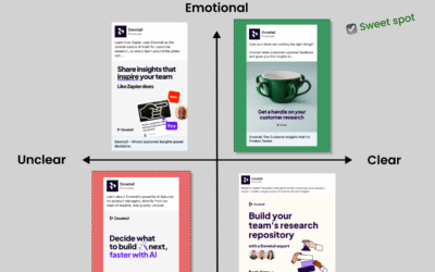
How to write LinkedIn ad copy that resonates: nail both clarity *and* emotion.
Here's how to write LinkedIn ad copy that resonates... Hit both co-ordinates on the Clear-Emotional Matrix: make sure your messaging is both clear and emotional. How to write clear LinkedIn ad copy:...
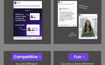
How to use spicy storytelling in your LinkedIn ad copywriting – 4 ad hooks to try
Writing ad creative is f*cking hard. Take it from me - I'm an ad copywriter for a living! 😅 Sometimes you don’t know whether to focus on pain-points or benefits or social proof... HELP. But it...
Before you write funny LinkedIn ads – make sure your storytelling is *clear* (not just clever).
A lot of SaaS teams get excited to write fun LinkedIn ads, thinking it'll grab attention. But if your ad is not clear on what your product does... your impact might be limited. I found a rarity! A...